Dialogue Editor
The Dialogue Editor is the primary workspace for creating, editing, and testing dialogue graphs in DialogueCraft. It provides a node-based graph view, a multi-tab interface, an inspector panel, in-editor preview, validation, and project-wide search.
Opening the Editor
Menu path: Tools > CraftWorks > DialogueCraft > Dialogue Editor
Keyboard shortcut: Ctrl+Shift+D (Windows) / Cmd+Shift+D (macOS)
The editor can also be opened by double-clicking any DialogueAsset in the Project window. Doing so opens the editor and loads that dialogue automatically.
The window has a minimum size of 1000x600 pixels and can be docked anywhere in the Unity editor layout like any other editor window. Only one instance of the Dialogue Editor can be open at a time; calling OpenWindow() again focuses the existing window.
The editor remembers its last active tab, panel visibility states, and the last opened dialogue between sessions via EditorPrefs.
Editor Layout
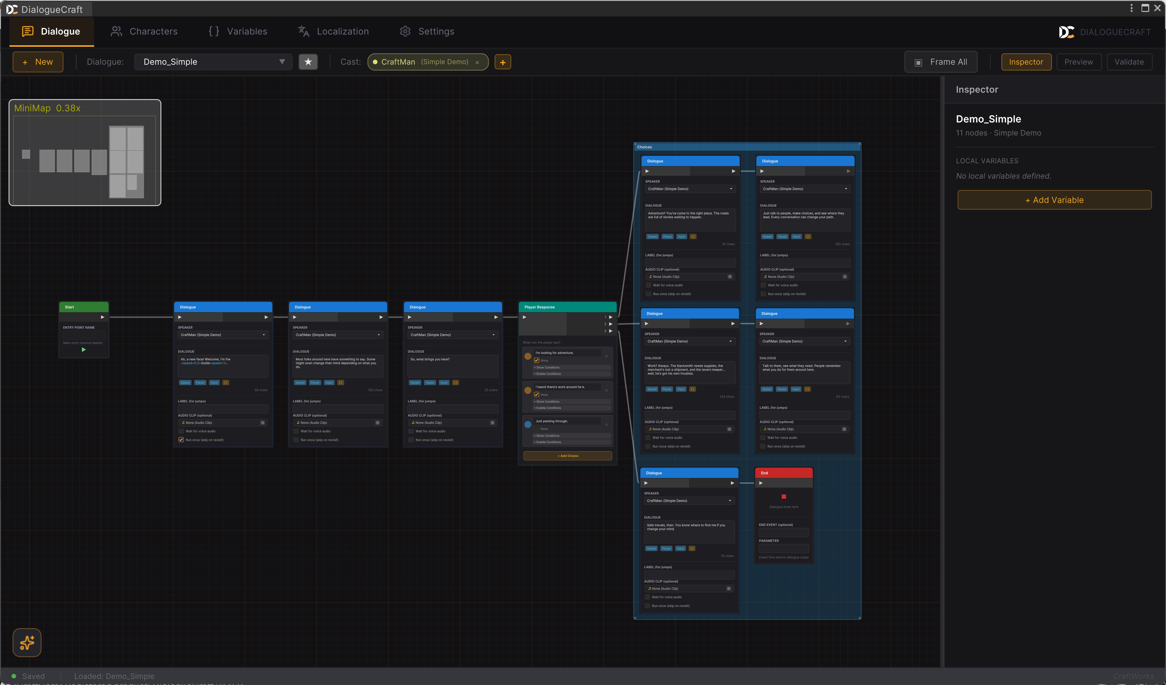
The editor is organized into the following regions:
- Tab Bar -- Top-level navigation between Dialogue, Characters, Variables, Localization, and Settings.
- Context Toolbar -- Dialogue-tab-specific controls: new dialogue, dialogue browser, tags, cast management, and panel toggles.
- Graph Canvas -- The main node editing area with a grid background. Contains the minimap (top-left), quick search bar (top-center when active), AI session button (bottom-left), and search panel overlay (top-right when active).
- Inspector Panel -- Right side panel showing properties of the selected node or comment box. Resizable by dragging its left edge (200px to 500px). Toggle with the toolbar button or press
I. - Preview Panel -- Far-right panel for testing dialogues without entering Play mode. Resizable (280px to 550px). Toggle with the toolbar button or press
P. - Validation Panel -- Bottom panel showing validation issues. Resizable by dragging its top edge (100px to 500px). Toggle with the toolbar button or press
V. - Status Bar -- Shows the current status message and save state at the bottom of the window.
Navigation
Panning
- Middle mouse button drag -- Pan the graph canvas.
- Alt + Left mouse button drag -- Alternative pan method.
- The
ContentDraggermanipulator handles all panning input.
Zooming
- Scroll wheel -- Zoom in and out.
- Zoom range: 10% to the default maximum scale defined by Unity's
ContentZoomer.
Minimap
A minimap is displayed in the top-left corner of the graph canvas (200x140 pixels). It provides an overview of all nodes and your current viewport position.
- Toggle visibility: press
Mor usegraphView.ToggleMinimap(). - The minimap is anchored and does not move with panning.
Framing
| Action | Shortcut | Description |
|---|---|---|
| Frame Selected | F | Zooms and pans to fit the selected node(s) in view. If nothing is selected, frames all nodes. |
| Frame All | A | Zooms and pans to fit every node in the graph. |
Edge Auto-Scroll
When dragging nodes or making rubber-band selections near the edges of the graph canvas, the viewport automatically pans in that direction. The scroll speed increases as the cursor gets closer to the edge (within a 40px margin).
Working with Nodes
Creating Nodes
There are several ways to create new nodes:
-
Right-click on empty space -- Opens the node creation search window with categorized node types:
- Dialogue: Text, Choice
- Flow: Condition, Random, Jump, Wait
- Sequence: Timeline, Camera, Fade, Audio, Actor, Animate, Signal, Shake, Spawn
- Structure: Entry Point, Sub-dialogue, End
- Logic: Variable, Event
- Other: Comment, Comment Box
-
Spacebar or right-click -- Opens the same search window at the cursor position.
-
Keyboard shortcuts -- Quick-create common node types:
T-- Create a Text node at the center of the viewportB-- Create a Branch (Condition) node at the center of the viewport
-
Drag from a port to empty space -- Opens the search window and automatically connects the new node to the source port (drag-to-create via
DialogueEdgeConnectorListener).
Connecting Nodes
- Drag from an output port to an input port to create a connection.
- Ports are type-compatible: you can only connect output ports to input ports on different nodes.
- Drag-to-create: Drag from a port and drop on empty space. The node creation search window opens, and the newly created node is automatically connected to the source port.
Selecting Nodes
- Left-click on a node to select it. The inspector panel updates to show its properties.
- Rubber-band selection -- Click and drag on empty space to select multiple nodes within the rectangle.
- Clicking on a comment box selects it and shows its properties in the inspector.
- Clicking on empty space deselects everything.
Multi-Select Operations
With multiple nodes selected, you can:
- Move them together by dragging.
- Delete them with
DeleteorBackspace. - Duplicate them with
Ctrl+D(preserves connections between selected nodes). - Copy/Paste with
Ctrl+C/Ctrl+V(preserves internal connections, generates new GUIDs, appends_copyto labels). - Align them using alignment shortcuts (see Keyboard Shortcuts below).
- Create a Comment Box around them by pressing
C.
Deleting
- Select nodes or edges and press
DeleteorBackspace. - Alt + Left-click on an edge to delete that single connection (Unreal Engine-style shortcut).
- Entry nodes cannot be deleted.
- Deleting a comment box does not delete the nodes inside it.
Copy and Paste
Ctrl+Ccopies selected nodes and their internal connections to a static clipboard.Ctrl+Vpastes at the center of the current viewport, with new GUIDs and offset positions.- Labels on pasted nodes are appended with
_copyto avoid duplicate label conflicts. - The clipboard is shared across all graph instances (static).
The Inspector
The inspector panel appears on the right side of the graph canvas when enabled. It displays editable properties for the currently selected element.
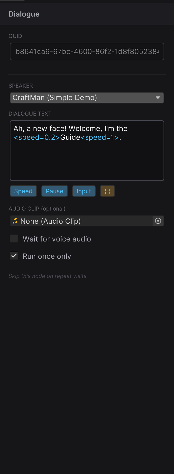
When a Node is Selected
The inspector shows all configurable fields for that node type. Fields vary by node type but commonly include:
- Speaker -- Character dropdown (filtered by cast, with "All Characters..." escape hatch)
- Dialogue Text -- Multi-line text field with variable substitution syntax highlighting
- Label -- Optional node label for jump targets and search
- Conditions -- Show/enable conditions for choices and branches
- Audio -- Voice clip or FMOD event path
- Variables -- Variable name, operation, and value fields
When a Comment Box is Selected
The inspector shows:
- Title -- Editable text field
- Color -- Color picker for the comment box background
- Hover Text -- Optional tooltip text shown when hovering the comment box header
When Nothing is Selected
The inspector shows the dialogue-level context: general information about the loaded dialogue asset.
Inline Editing vs. Inspector
Many node properties can be edited both inline on the node (directly in the graph) and in the inspector panel. Changes made in either location are synchronized bidirectionally. The inspector provides a more detailed editing experience, while inline editing is faster for quick adjustments.
During Preview Mode, the inspector is locked (all fields disabled, reduced opacity) to prevent accidental edits.
Toolbar
The context toolbar at the top of the Dialogue tab contains the following controls, from left to right:
| Control | Description |
|---|---|
| + New | Creates a new DialogueAsset in the project. |
| Dialogue Browser | Dropdown button showing the current dialogue name. Click to open the browser popup. |
| Tags | Star button to manage tags on the current dialogue. |
| Cast | Shows participant character chips with remove buttons. Click + to add a character to the dialogue's cast. |
| Frame All | Zooms to fit all nodes in view. |
| Inspector | Toggle button for the inspector panel. |
| Preview | Toggle button for the preview panel. |
| Validate | Toggle button for the validation panel. |
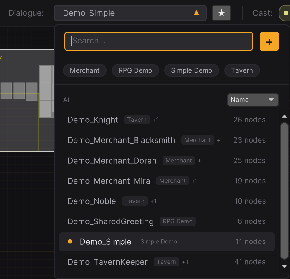
Dialogue Browser
The dialogue browser is a dropdown popup (320px wide) for quickly finding, opening, and managing dialogue assets across the entire project.
Opening
Click the dialogue selector button in the toolbar (shows the current dialogue name, or "Select...").
Features
- Search -- Type to filter dialogues by name. Results update live.
- Tag Filtering -- If dialogues have tags, filter chips appear below the search bar. Click a tag to filter; click again to deselect.
- Sort Options -- Sort the list by Name, Recent, or Nodes (node count).
- Create New -- Click the
+button in the browser header to create a new dialogue. - Keyboard Navigation -- Use
Up/Downarrows to navigate the list,Enterto open the selected dialogue,Escapeto close.
Managing Dialogues
Right-click on any dialogue in the browser for a context menu with:
| Action | Shortcut | Description |
|---|---|---|
| Rename | F2 | Inline rename with validation. Also updates dialogueId if it matches the old name. |
| Duplicate | Ctrl+D | Creates a copy in the same directory with a unique name. Opens inline rename for the copy. |
| Delete | Delete | Confirms via dialog, then permanently deletes the asset file. |
| Show in Project | -- | Pings the asset in the Unity Project window. |
The browser tracks the 5 most recently opened dialogues. The currently loaded dialogue is highlighted with an amber indicator dot.
Preview Mode
Preview mode lets you test dialogue flow directly in the editor without entering Unity's Play mode. It simulates the DialogueRunner logic including branching, variable operations, choice conditions, sub-dialogues, and localization.
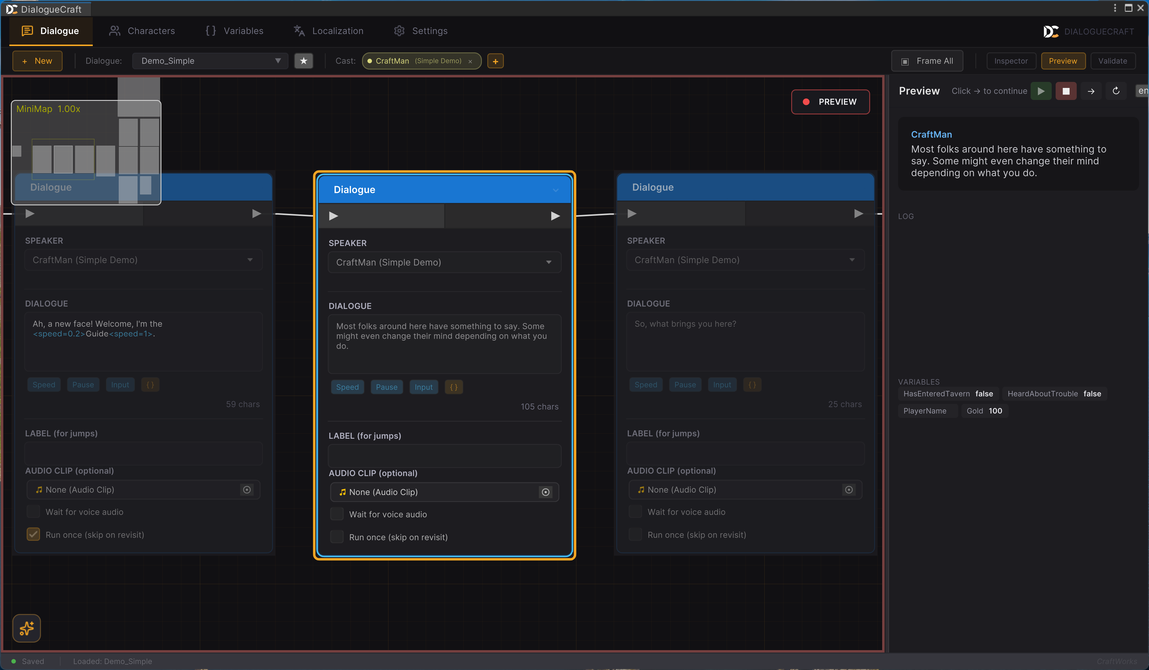
Starting a Preview
- Open the Preview panel (click Preview in the toolbar or press
P). - Click the Play button (green) to start from the entry node.
- The graph enters preview mode: a red border appears around the canvas, a "PREVIEW" badge with a pulsing dot appears in the top-right corner, and all nodes are locked (non-editable).
Controls
| Button | Symbol | Description |
|---|---|---|
| Play | > (green) | Start preview from the entry node. |
| Stop | Square (red) | Stop the preview and exit preview mode. |
| Next | Right arrow | Advance to the next node (when waiting for continue). |
| Restart | Loop arrow | Restart the preview from the beginning. |
The Enter key toggles playback (starts if stopped, continues if waiting).
During Preview
- The current node is highlighted in the graph with a preview selection style.
- The dialogue text and speaker name appear in the preview panel's dialogue area.
- When choices are presented, click a choice button to select it.
- A LOG section records every step: dialogue lines, choices made, variable changes, events fired, warnings, and errors.
- A VARIABLES section shows the current state of all variables as chips.
- Sub-dialogues are fully supported: the graph view switches to show the sub-dialogue, and switches back when it returns.
Language Selection
A language dropdown in the preview header lets you test localized text. It pulls available languages from the configured localization provider (Built-In, LocalizeCraft, or Unity Localization).
Exiting Preview
Click Stop or close the Preview panel. The graph returns to normal editing mode, the red border disappears, and nodes become editable again.
Validation
The validation engine (ValidationEngine) automatically checks the loaded dialogue for common issues every time the graph is saved. Results appear as badges on individual nodes and in the validation panel.
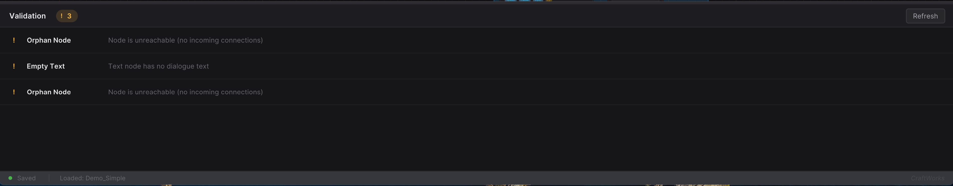
Validation Checks
| Check | Severity | Description |
|---|---|---|
| Dead End | Warning | A non-End node with no outgoing connections (the dialogue would stop unexpectedly). |
| Orphan Node | Warning | A node not reachable from any entry point. |
| Missing Speaker | Warning | A Text node without a character assigned. |
| Empty Text | Warning | A Text node with blank dialogue text. |
| Broken Jump | Error | A Jump node targeting a label or GUID that does not exist. |
| Broken Sub-dialogue | Error | A Sub-dialogue node with no target dialogue assigned, or the target is missing. |
| Duplicate Label | Warning | Two or more nodes sharing the same label string. |
| Undefined Variable | Warning | A Variable or Branch node referencing a variable name not found in any database. |
| Missing Audio | Info | A Text node with a voice clip field that is empty (if audio is expected). |
| Unreachable Choice | Warning | A Choice option whose show-conditions can never be satisfied. |
Node Badges
After validation, nodes with issues display a small badge indicating the highest severity:
- Red badge -- At least one error
- Yellow badge -- Warnings (no errors)
- Blue badge -- Info only
Hover over a badge to see a tooltip listing all issues for that node.
Validation Panel
The panel (toggled with V or the toolbar button) shows:
- Header with severity count badges (errors, warnings, info) and a Refresh button.
- Issue list sorted by severity (errors first). Each row shows:
- Severity icon
- Issue type name
- Message (with tooltip for full text)
- Quick Fix button (if available, amber-styled)
- Delete button (appears on hover, for removing problematic nodes)
- Clicking any issue row selects and frames the corresponding node in the graph.
- When no issues are found, a green checkmark with "No issues found" is displayed.
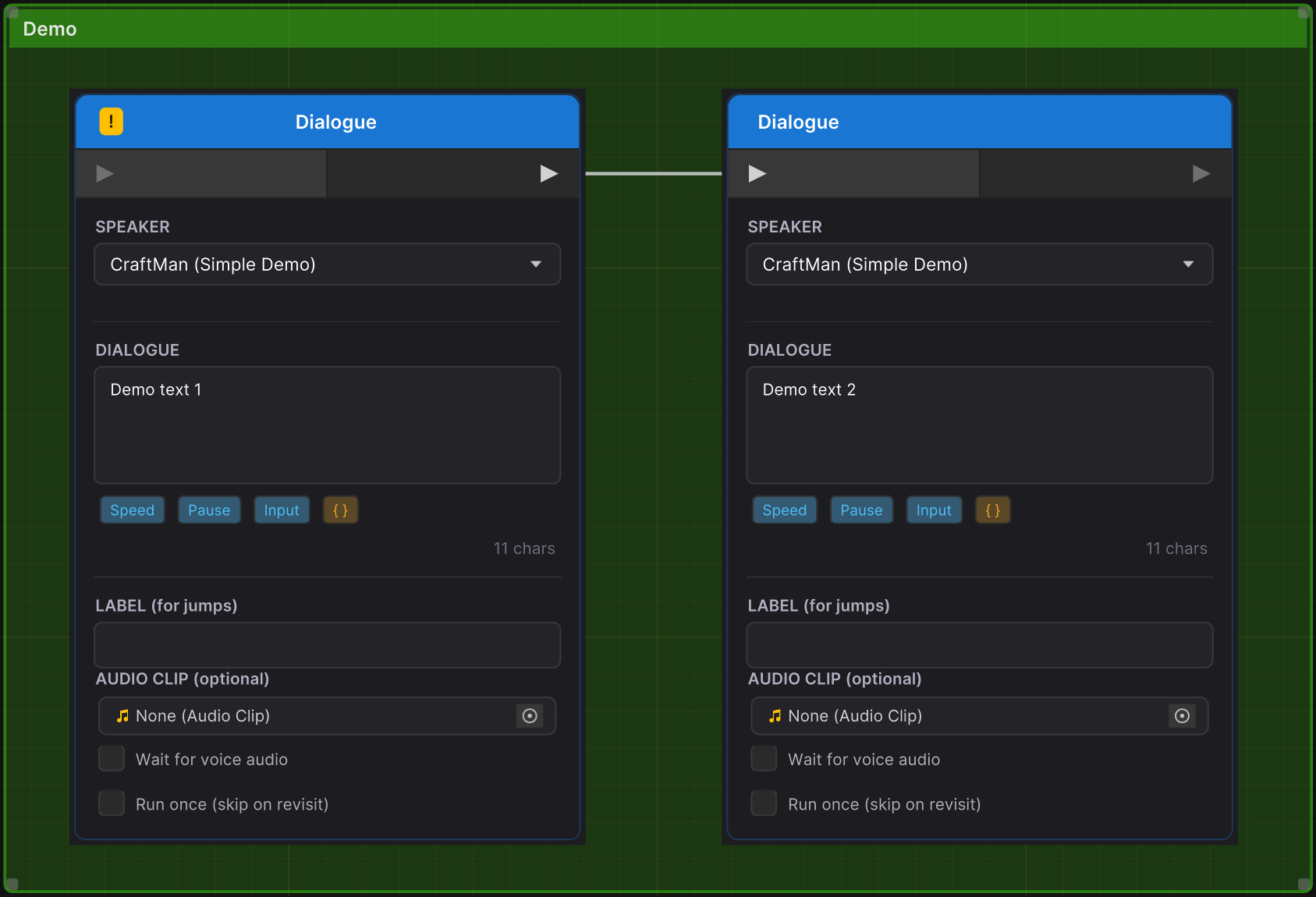
Comment Boxes
Comment boxes are visual grouping elements that sit behind nodes on the graph canvas. They behave similarly to Unreal Engine's comment boxes.
Creating
- Select one or more nodes and press
Cto create a comment box that encompasses them. - Or choose "Comment Box" from the right-click node creation menu to create an empty box at the cursor.
Behavior
- Resizable by dragging edges or corners (minimum size: 120x80 pixels).
- Movable -- Dragging a comment box moves all nodes whose centers are inside it. Nodes that are also selected (e.g., via rubber-band) are not double-moved.
- Title editing -- Double-click the header to edit the title inline. Press
Enterto confirm orEscapeto cancel. - Color -- Set via the inspector panel when the comment box is selected. The color is applied at 20% opacity for the background and 40% for the header.
- Hover text -- Set via the inspector. Appears as a tooltip when hovering over the header.
- Selection -- Click to select. Shows a blue selection border. Selecting a comment box shows its properties in the inspector.
- Deletion -- Select and press
Delete. Deleting a comment box does not delete the nodes inside it. - Layer -- Comment boxes render behind all nodes (layer -100).
Keyboard Shortcuts
All shortcuts are customizable via Settings > Shortcuts in the editor. The table below shows the default bindings. Shortcuts are suppressed when a text input field has focus.
Node Creation
| Command | Default Shortcut | Description |
|---|---|---|
| Create Text Node | T | Creates a Text node at the viewport center. |
| Create Branch Node | B | Creates a Condition (Branch) node at the viewport center. |
| Create Comment Box | C | Wraps selected nodes in a comment box. |
Edit Operations
| Command | Default Shortcut | Description |
|---|---|---|
| Delete | Delete | Deletes selected nodes, edges, or comment boxes. |
| Duplicate | Ctrl+D | Duplicates selected nodes with connections. |
| Copy | Ctrl+C | Copies selected nodes to clipboard. |
| Paste | Ctrl+V | Pastes nodes from clipboard at viewport center. |
View
| Command | Default Shortcut | Description |
|---|---|---|
| Frame Selected | F | Frames the selected node(s). If none selected, frames all. |
| Frame All | A | Frames all nodes in the graph. |
| Toggle Minimap | M | Shows or hides the minimap. |
| Toggle Inspector | I | Shows or hides the inspector panel. |
| Toggle Preview | P | Shows or hides the preview panel. |
| Toggle Validation | V | Shows or hides the validation panel. |
Preview
| Command | Default Shortcut | Description |
|---|---|---|
| Play/Pause Preview | Enter | Starts preview if stopped, or continues if waiting. |
Search
| Command | Default Shortcut | Description |
|---|---|---|
| Quick Search | Ctrl+F | Opens the in-graph quick search bar (text mode). |
| Project Search | Ctrl+Shift+F | Opens the floating project-wide search panel. |
| Go to Label | Ctrl+G | Opens the quick search bar in label navigation mode. |
| Search & Replace | Ctrl+H | Opens the project-wide search panel (same as Project Search). |
Alignment
| Command | Default Shortcut | Description |
|---|---|---|
| Align Top | Shift+W | Aligns selected nodes to the topmost node's Y position. |
| Align Bottom | Shift+S | Aligns selected nodes to the bottommost node's bottom edge. |
| Align Left | Shift+A | Aligns selected nodes to the leftmost node's X position. |
| Align Right | Shift+D | Aligns selected nodes to the rightmost node's right edge. |
Alignment requires at least 2 selected nodes.
AI
| Command | Default Shortcut | Description |
|---|---|---|
| Toggle AI Session | Ctrl+Shift+A | Starts or ends an AI writing session. |
Other
| Action | Input | Description |
|---|---|---|
| Delete edge | Alt+Left-click on edge | Removes a single connection without selecting it first. |
| Undo | Ctrl+Z | Standard Unity undo (graph changes are recorded). |
Search
DialogueCraft provides two search systems for finding content in your dialogues.
Quick Search (Ctrl+F)
A floating search bar that appears at the top of the graph canvas. It supports two modes, toggled with Tab or by clicking the mode icon:
Text Mode (default, Ctrl+F):
- Searches dialogue text, choice text, and other content within the current dialogue.
- Results appear in a dropdown below the search bar showing matched text, speaker name, and node type.
- Navigate between results with
Enter/Shift+Enter, arrow keys, or the up/down buttons. - Matching nodes are highlighted in the graph. The current result is distinctly highlighted.
Labels Mode (Ctrl+G):
- Shows all labeled nodes in the current dialogue.
- Filter by typing a label name or preview text.
- Select a label to jump to that node.
Press Escape to close the quick search bar.
Project Search (Ctrl+Shift+F)
A floating panel (top-right of the graph) for searching across all dialogues in the project.
Features:
- Find and Replace -- Search field with a replace field always visible. "Replace All" button applies changes with undo support.
- Options -- Case sensitive (
Aa), Whole word (W), Regex (.*) toggles. - Filters -- Filter by node type (All, Text, Choice, Variable, Comment) and scope (All dialogues or Current dialogue).
- Results -- Grouped by dialogue asset, with expandable sections. Click any result to navigate to that node (loads the dialogue if needed).
- Draggable -- Drag the panel header to reposition it within the graph area.
Tabs Overview
The editor window has five top-level tabs. The Dialogue tab is documented above. The other four tabs provide access to project-wide data:
Characters Tab
A two-panel layout for managing the CharacterDatabase:
- Left panel -- Searchable, sortable list of all characters with filter toolbar. Each card shows the character name, portrait, and name color.
- Right panel -- Detail editor for the selected character: display name, name color, portrait, description, tags, and typewriter voice settings (Unity AudioClip or FMOD event, with Single/Random/Vowel modes).
- Toolbar -- "New" button to add characters, and a database selector field.
Changes are saved immediately to the CharacterDatabase ScriptableObject.
Variables Tab
A two-panel layout for managing the VariableDatabase:
- Left panel -- Searchable, sortable list of global variables with type filter chips (INT, FLT, BOOL, STR).
- Right panel -- Detail editor for the selected variable: name, type, default value, tags, and description.
- Toolbar -- "New" button to add variables, and a database selector field.
Variable types are displayed with colored badges: blue for INT, purple for FLT, green for BOOL, orange for STR.
Localization Tab
Provides tools for managing translations:
- Translation table view with source text and translations per language.
- Integration with the built-in localization system or external providers (LocalizeCraft, Unity Localization).
- Import/export capabilities.
Settings Tab
Project-wide DialogueCraft configuration, organized into sidebar categories:
| Category | Contents |
|---|---|
| General | Default databases (Characters, Variables), audio source (Unity/FMOD), localization provider. |
| Typewriter | Global typewriter speed, sound, and pitch variation defaults. |
| Editor | Graph editor preferences and visual settings. |
| Shortcuts | Full shortcut customization table. Each shortcut can be rebound or cleared. Includes "Reset All" to restore defaults. |
| About | Version information and links. |
Key Classes Reference
| Class | File | Purpose |
|---|---|---|
DialogueEditorWindow | Editor/DialogueEditor/DialogueEditorWindow.cs | Main editor window with tabbed interface. |
DialogueGraphView | Editor/DialogueEditor/DialogueGraphView.cs | GraphView subclass for the node canvas. |
ShortcutManager | Editor/DialogueEditor/ShortcutManager.cs | Customizable keyboard shortcut registry. |
CommandRegistry | Editor/DialogueEditor/CommandRegistry.cs | Central command registry with fuzzy search. |
CommentBoxElement | Editor/DialogueEditor/CommentBoxElement.cs | Resizable comment box graph element. |
DialogueBrowserPopup | Editor/DialogueEditor/DialogueBrowserPopup.cs | Dialogue asset browser popup. |
DialogueSearchWindow | Editor/DialogueEditor/DialogueSearchWindow.cs | Node creation search window (right-click menu). |
DialogueEdgeConnectorListener | Editor/DialogueEditor/DialogueEdgeConnectorListener.cs | Drag-to-create edge handler. |
DialoguePreviewPanel | Editor/Preview/DialoguePreviewPanel.cs | Preview panel UI. |
DialoguePreviewController | Editor/Preview/DialoguePreviewController.cs | Preview simulation engine. |
QuickSearchBar | Editor/Search/QuickSearchBar.cs | In-graph text and label search. |
SearchPanel | Editor/Search/SearchPanel.cs | Project-wide search and replace panel. |
ValidationPanel | Editor/Validation/ValidationPanel.cs | Validation results panel UI. |
ValidationEngine | Editor/Validation/ValidationEngine.cs | Dialogue graph validation logic. |